
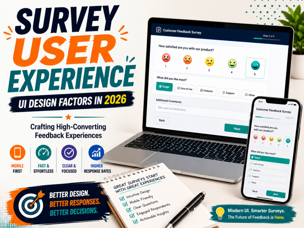
In the digital world, data is king. Every company wants feedback from their users. They want to know what users think, what they love, and what they hate. To get this data, companies use surveys. But there is a huge problem. People hate filling out surveys. Most surveys have very low completion rates.
Why do people abandon surveys? The answer is simple: bad user interface (UI) design.
A survey is not just a list of questions. It is a digital product. It requires a great survey user experience. If your survey looks like an old tax form, people will close it. If the buttons are too small, people will get frustrated.
User expectations have shifted. Today, people want speed, clear navigation, and beautiful interfaces. Modern ui design trends emphasize clean layouts, subtle motion, and accessibility.
If you want high-converting feedback experiences, you must focus on design. This guide will show you how UI design shapes human behavior. You will learn the best practices for creating beautiful, high-converting surveys.
How Does UI Design Affect Survey Response Rates?
Many people think the questions are the only thing that matters in a survey. This is a big mistake. The visual presentation of your survey plays a massive role in how people behave.
So, how does ui design affect survey response rates?
The Psychology of Visual Friction
When a user opens a webpage, their brain makes a fast decision. They decide if the page is easy or hard to use. This is called cognitive load.
If a survey has dense text, tiny input boxes, and no white space, the brain senses high cognitive load. The user feels tired before they even read the first question. This visual friction leads to immediate abandonment.
On the other hand, a clean interface creates a low cognitive load. It feels light and easy. The user feels they can finish it quickly.
Trust and Professionalism
A beautiful UI design builds instant trust. If a survey looks outdated or broken, users might worry about data privacy. They might think the site is insecure.
A polished, modern UI design shows that your brand cares about quality. It makes the respondent feel safe sharing their thoughts.
The Peak-End Rule
Human memory is shaped by specific moments. We remember the hardest part of an experience (the peak) and the very end of the experience.
If your survey has a confusing matrix question where the radio buttons do not align, that becomes the painful peak. The user will remember that frustration. They will likely quit. But if the progress is smooth and the microinteractions feel satisfying, the user leaves with a positive feeling. They will be happy to answer your future surveys.
Core UI Design Trends Shaping Survey UX
UI design is always changing. What worked five years ago does not work now. To keep users engaged, you must use modern design patterns. Let us look at the top design trends that make surveys highly engaging.
1. Adaptive and Personalized Interfaces
Static, boring forms are outdated. Today, interfaces must be dynamic. The UI should change based on what the user does.
For example, when a user selects an option, the next question should appear instantly with a smooth transition. This is called progressive disclosure. You do not show all questions at once. You show them one by one. This keeps the screen clean and prevents overwhelm.
2. Immersive “One Thing at a Time” Layouts
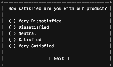
One of the best ways to increase conversions is to show only one question per screen. This layout is very popular. It helps the user focus. There are no distracting elements around the question. The entire screen is dedicated to a single task. Once the user answers, the interface slides gracefully to the next screen.
3. Glassmorphism 2.0 and Tactile Textures
Visual depth is back in a big way. Modern designs use translucent panels, soft background blurs, and waxy textures. This makes the survey look like it is floating over a beautiful, soft background. It feels modern and high-end.
However, you must be careful with contrast. Ensure your text stands out clearly against these beautiful, glassy surfaces.
4. Functional Microinteractions
A microinteraction is a tiny visual reaction to a user’s action. For example, when a user hovers over an option, the card expands slightly. When they click a rating button, it pulses with a subtle splash of color.
These tiny details make the survey feel alive. They give the user immediate feedback. This visual confirmation is highly satisfying to the human brain.
Best Survey User Interface Design Practices
To build the best survey user interface design, you need to combine structure, visual hierarchy, and clear typography. Here are the core rules to follow.
1. Establish a Strong Visual Hierarchy
Your questions must be the most important thing on the screen. Use a large, readable font size for the question text. Keep the answer labels slightly smaller but still highly legible.
Use color to guide the eye. Your action buttons, like “Next” or “Submit”, should have the highest contrast. Use your primary brand color for these buttons so they are impossible to miss.
2. Choose the Right Typography
Legibility is crucial. For digital screens, sans-serif fonts are usually the safest choice. Fonts like Arial, Inter, or Roboto look crisp and clean on all screen sizes.
If your survey has longer introductory text, a highly legible serif font like Merriweather can help users read faster. Keep your text dark and your background light. High contrast is a non-negotiable standard for readability.
3. Use White Space Generously
Do not crowd your elements. Give your questions and answers room to breathe. White space reduces visual noise. It helps the user process the information without feeling rushed. It also prevents accidental clicks, which are very frustrating.
4. Implement Interactive Indicators and Progress Bars
A progress bar is a powerful psychological tool. It sets clear expectations. If a user does not know how long a survey is, they might quit after three pages. A progress bar shows them exactly how close they are to the finish line.
- Place it at the bottom: Studies show that progress bars at the top of the screen can be distracting. Put them at the bottom so they do not draw focus away from the questions.
- Keep it simple: Use a simple visual bar. You do not need to show percentages or page numbers. A simple loading bar is highly motivating.
Mobile Friendly Survey UI Factors
More than half of your respondents will open your survey on their smartphones. If your survey is not optimized for mobile, your data quality will crash. You must design with a mobile-first mindset.
Let us explore the essential mobile friendly survey ui factors.
1. Large Tap Targets
A mouse cursor is highly precise. A human thumb is not. On a mobile screen, all buttons, checkboxes, and radio buttons must be large.
If your buttons are too small, users will tap the wrong option. This leads to bad data and angry users.
- Minimum size: Make sure all interactive elements are at least 48×48 pixels.
- Button spacing: Leave enough space between options. If buttons are too close, the user might tap two at once.
2. Single-Column Layouts
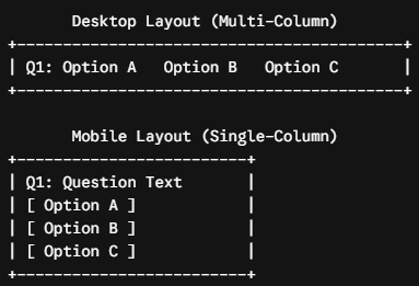
Never use multi-column layouts or wide tables on a mobile survey. Horizontal scrolling is the ultimate conversion killer.
Always stack your elements vertically. The question should be at the top, and the answer options should line up neatly below it. This allows the user to scroll naturally with their thumb in a single direction.
3. Avoid Grids and Matrix Questions
Matrix questions (where you rate multiple items on a grid) are a nightmare on mobile. They require the user to pinch, zoom, and scroll sideways to see the labels.
If you need to ask matrix questions, break them down. Turn each row of the matrix into an individual, single-select question on its own screen. It might feel like more steps, but it actually speeds up completion times because the friction is gone.
4. Tap More, Type Less
Typing on a mobile keyboard is slow and annoying. It requires effort. If your mobile survey has five long text fields, users will close it.
To boost conversions, use tap-friendly input methods.
- Radio buttons for single-select questions.
- Checkboxes for multi-select questions.
- Visual cards with icons or images instead of text labels.
- Star ratings or smiley scales for satisfaction metrics.
Only use open-ended text boxes when you absolutely need qualitative context. Keep them short, and never make them mandatory.
Comparative Breakdown: High-Converting vs. Low-Converting UI Elements
To help you audit your current surveys, let us compare bad design habits with high-converting alternatives.
| Low-Converting UI Element | High-Converting UI Alternative | Why It Works |
| Multi-Column Matrix Grids | Stacked Single-Selection Cards | Eliminates horizontal scrolling and reduces visual clutter on mobile screens. |
| All Questions on One Page | “One Thing at a Time” Slides | Keeps the focus high and reduces immediate cognitive load. |
| Tiny Radio Buttons | Large, Tap-Friendly Cards | Accommodates natural touch input and prevents accidental clicks. |
| No Progress Indicator | Bottom-Anchored Progress Bar | Motivates the user by showing how close they are to completion. |
| Complex Dropdown Menus | Clear Vertical Lists | Saves users from extra taps to open and scroll through hidden lists. |
| Heavy Images/Logos | Lightweight, Clean Styling | Speeds up load times on slow mobile networks. |
Optimizing for Accessibility (WCAG Compliance)
Accessibility is no longer an afterthought. It is a fundamental design standard. When you make your survey accessible, you make it easier for everyone to use.
1. Ensure High Color Contrast
Your text must stand out clearly from your background. Use dark gray or black text on a clean, light background. If you use custom brand colors for your buttons, verify that the text inside the button has a strong contrast ratio (at least 4.5:1 for standard text).
2. Support Screen Readers
Make sure your survey code is built with clean, semantic HTML. Screen readers rely on proper tags to navigate forms. Use standard label tags for questions and input fields so that visually impaired users can navigate your survey with ease.
3. Keyboard Navigation
Some users cannot use a mouse or a touchscreen. Your survey should be fully navigable using only the “Tab” and “Enter” keys on a keyboard. The active interactive element should always have a highly visible focus outline so the user knows where they are.
Testing Your Survey UI: The Path to Perfection
You should never launch a survey without testing it. What looks beautiful on your giant designer monitor might look broken on an older Android device.
1. Cross-Device Auditing
Open your survey on multiple real devices. Test it on an iPhone, an Android phone, a tablet, and a laptop. Look for:
- Text wrapping that breaks the layout.
- Buttons that overlap.
- Heavy images that load too slowly on poor mobile connections.
2. Conduct User Testing
Before sending the survey to your whole database, send it to a small group. Watch them interact with it if possible.
Are they pausing at a specific question? Do they struggle to tap a button? Use this qualitative feedback to refine the user flow.
3. Run A/B Tests
If you want to maximize conversions, run an A/B test. Create two versions of your survey. Use a standard layout for Version A. Use a “one question at a time” sliding layout for Version B. Compare the completion rates after a few hundred responses. The data will tell you exactly what your audience prefers.
Conclusion: Elevating the Feedback Experience
Designing a survey is an act of respect. You are asking your users for their most valuable asset: their time.
If you respect their time, you must respect their experience. A survey with a thoughtful, modern survey user experience shows that you value their input. By keeping your layouts simple, your touch targets large, and your flow conversational, you remove the friction that kills feedback loops.
Do not settle for boring, outdated forms. Embrace clean ui design trends, focus on mobile friendly survey ui factors, and watch your completion rates soar. Your users will thank you with clean, reliable, and high-quality data.
Frequently Asked Questions (FAQ)
1. What is survey user experience?
Survey user experience (Survey UX) refers to how respondents feel while completing a survey.
It includes factors such as:
- Ease of navigation
- Mobile usability
- Visual design
- Question readability
- Loading speed
- Overall satisfaction
A good survey user experience makes surveys feel simple, fast, and enjoyable.
2. Why is survey user experience important?
Survey UX directly impacts:
- Survey response rates
- Completion rates
- Data quality
- Respondent satisfaction
- Brand perception
Poor experiences often lead to survey abandonment and lower-quality responses.
3. How does UI design affect survey response rates?
UI design has a significant impact on survey participation.
A well-designed survey can:
✅ Increase completion rates
✅ Reduce respondent fatigue
✅ Improve response quality
✅ Encourage thoughtful answers
Poor UI design often causes users to abandon surveys before completion.
4. What makes a survey mobile friendly?
A mobile friendly survey UI should include:
- Large buttons
- Vertical layouts
- Readable fonts
- Fast loading speeds
- Limited scrolling
- Responsive question formats
Since most users now complete surveys on smartphones, mobile optimization is critical.
5. What are the biggest survey UI mistakes?
Common mistakes include:
❌ Too many questions on one page
❌ Tiny fonts
❌ Poor mobile responsiveness
❌ Large matrix tables
❌ Long loading times
❌ Confusing navigation
These issues can dramatically reduce completion rates.
6. What are the latest UI design trends for surveys in 2026?
Popular UI design trends include:
- Conversational surveys
- AI-powered personalization
- Mobile-first layouts
- Minimalist interfaces
- Interactive question types
- Dark mode support
- Progress indicators
- Personalized survey experiences
Modern users expect surveys to feel like modern applications.
7. What is the best survey user interface design?
The best survey user interface design is:
✅ Clean
✅ Simple
✅ Fast
✅ Mobile friendly
✅ Accessible
✅ Visually organized
The goal is to remove friction and make answering questions effortless.
8. Why do users abandon surveys?
Common reasons include:
- Survey is too long
- Poor mobile experience
- Confusing layout
- Repetitive questions
- Lack of progress indicators
- Slow loading times
Improving UX can significantly reduce abandonment.
9. Do progress bars improve survey completion rates?
Yes.
Progress indicators help respondents understand:
- How much they have completed
- How much remains
This reduces uncertainty and often increases completion rates.
10. Are one-question-per-page surveys better?
In many cases, yes.
One-question layouts:
- Feel less overwhelming
- Improve mobile usability
- Create conversational experiences
- Reduce cognitive load
However, survey length and audience should also be considered.
11. Why is mobile optimization important for surveys?
More than half of survey responses now come from mobile devices.
Without mobile optimization, respondents may experience:
- Difficult navigation
- Small buttons
- Broken layouts
- Increased frustration
Mobile-first design is no longer optional in 2026.
12. What colors work best in survey UI design?
Light, clean colors generally perform best.
Recommended design principles include:
- High contrast text
- Limited color palettes
- Minimal distractions
- Consistent branding
The design should help users focus on answering questions.
13. How long should a survey take?
Most experts recommend keeping surveys under:
5–10 minutes
Shorter surveys usually produce:
- Higher completion rates
- Better response quality
- Lower abandonment
14. What is conversational survey design?
Conversational surveys mimic natural interactions.
Examples include:
- Chat-style interfaces
- One question per screen
- Personalized language
This approach often feels more engaging and less intimidating.
15. How can businesses improve survey response rates?
Businesses can improve response rates by:
✅ Optimizing mobile experiences
✅ Simplifying layouts
✅ Using progress indicators
✅ Reducing survey length
✅ Personalizing questions
✅ Improving survey user experience
UX improvements often generate better results than simply offering incentives.
16. Are matrix questions bad for mobile surveys?
Not necessarily.
However, large matrix tables often create poor mobile experiences.
Modern survey platforms increasingly use:
- Responsive matrix layouts
- Card-based alternatives
- Simplified rating interfaces
This improves usability on smartphones.
17. Does accessibility matter in survey design?
Absolutely.
Accessible surveys allow participation from:
- Older users
- Users with disabilities
- Screen reader users
- Respondents with visual impairments
Accessibility improvements often improve usability for everyone.
18. Can AI improve survey user experience?
Yes.
AI is increasingly used to:
- Personalize survey flows
- Adapt questions dynamically
- Predict survey fatigue
- Improve response quality
AI-powered surveys are becoming a major trend in 2026.
19. What industries benefit most from better survey UX?
Almost every industry benefits, including:
- SaaS companies
- Healthcare organizations
- Educational institutions
- Restaurants
- Retail businesses
- Market research firms
- HR teams
Better survey experiences generally produce better feedback.
20. How does SurveyFlip improve survey user experience?
SurveyFlip helps businesses create modern survey experiences with:
✅ Mobile-responsive survey layouts
✅ Interactive question types
✅ Smart matrix questions
✅ Clean UI templates
✅ Real-time analytics
✅ AI-powered insights
This helps organizations increase survey completion rates and collect higher-quality feedback.